The Economics of Sport
  • Sports Economics
  • About
  • Workshop
  • Selected Publications
  • Book Reviews
  • A Primer on Gaelic Games
  • Upcoming Events
  • Media
  • Education
  • Resources & Links
  • Data

Pundit Predictions in the GAA

29/9/2017

 
By John Eakins

We have commented a number of times on pundit predictions in the English Premier League (especially posts from Dave, see here for a recent example). Our interest in this area stems from the research which suggests that expert predictions are not necessarily as accurate as non-expert predictions. That is, experts do not possess any innate superior skills relative to the ordinary person especially when it comes to predicting future outcomes.

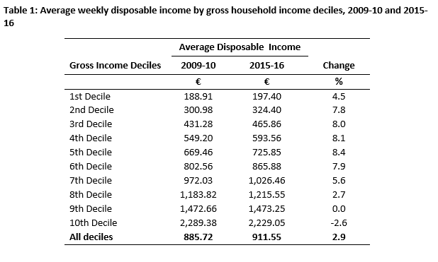
All of our articles have focused on expert predictions from the English Premier League as this appears to be the only available pundit data which includes predictions for the match outcome as well as the final score line. I was therefore intrigued to see the Irish Independent include a full page spread on expert predictions in the lead up to both the All-Ireland hurling and football finals which took place on Sunday September 2nd and September 17th last. The predictions not only included who they thought would win but also what they thought the final score line would be. The predictions are given below along with the actual final score in both matches. While we cannot compare these predictions to non-experts, we can assess their overall accuracy and compare the hurling pundits with the football pundits.
Picture
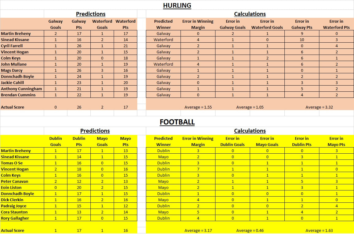
Note: Goals are worth 3 points
In the hurling, 9 out of the 11 pundits (81.8%) correctly predicted that Galway would win while in the football, 7 out of the 12 pundits (58.3%) correctly predicted that Dublin would win. In relation to the score line predictions there are a number of ways of looking at this. We can look at the average of the difference between the predicted winning margin and the actual winning margin (in statistical jargon, this is the mean absolute error). For example, Martin Breheny predicted a 3 point win for Galway in the hurling decider and Galway won by 3 points so the difference here is 0. In contrast, Sinead Kissane predicted a 1 point win for Waterford so the difference between the predicted winning margin and the actual winning margin is 4. Doing this for all pundits and averaging we find that the hurling pundits had a value of 1.55 while the football pundits have a value of 3.17. Again the hurling pundits win out although this latter measure is closely correlated with the accuracy in predicting who wins the match in the first place.

A final measure, uncorrelated with match outcome, is how accurate each pundit is in predicting the final score line, goals and points, rather than overall points. We again calculate the mean absolute error for both the prediction of the number of goals scored and the number of points scored. The hurling pundits produce values of 1.05 and 3.32 respectively while the football pundits produce values of 0.46 and 1.63 respectively. It is interesting that the hurling pundits are better are predicting the closeness of the game while the football pundits are better at predicting the amount of scores (goals and points). I wonder does this hold for all games. Unfortunately I will have to wait until the punditry of predicting GAA outcomes fully catches on rather than just for the All Ireland finals.

Changes To Inter-County Hurling Competition Design

27/9/2017

 
By Robbie Butler

Competition design is one of the most fundamental aspects of sports economics. Given the peculiar nature of competition in this field, and the need for joint production, the manner in which competitions are designed are often essential for the success and stability of sports.
 
Central to competition design are the issues of uncertainty-of-outcome and competitive balance. Any student taking a course in sports economics will probably meet these issues very early in their studies (my own class just have). Organisers regularly face the trade-off between contest quality and uncertainty-of-outcome. Between maximising winning effort or overall effort.
 
This Saturday, a Special Congress of the Gaelic Games Association (GAA) will meet in Croke Park to discuss, yet again, competition design within inter-country hurling. A number of county boards have submitted proposed changes to the current structure. The proposal that has probably received the most attention is the changing of the current knock-out Leinster and Munster championships, and their replacement with a round-robin competition from 2018. 
 
What might this mean? Well, one thing for sure is more games. For example, in Muster (excluding replays) there are just four games each summer. One quarter-final, two semi-finals and the Munster Final. Moving to a round-robin format, with the same 5 counties involved in the current Munster Championship, will result in a 10 games. A 250% increase. That’s before other play-off games are potentially introduced to decide the winner.
 
Other than giving sports economists more data to exploit, the increase in the number of games should result in an increase in broadcasting rights to the GAA. The competition design may also be beneficial from a sporting perspective sense as leagues are regarded as better than knock-out competitions in finding the “best” ranking of team abilities.
 
For those traditionally ‘weaker’ counties this isn’t good news as a league format should reduce uncertainty-of-outcome at the macro level. The plus side of course is that weaker teams will get to play repeatedly against stronger opposition under a round-robin format, whereas under the old knock-out system they may have played just one game before elimination.

Global Sports Salaries Survey 2016

25/9/2017

0 Comments

 
By Stephen Brosnan

​The Global Sports Salaries Survey (GSSS) is an annual report that provides a comparative analysis of the average salaries of sports teams across a range of sports including soccer, basketball, baseball, American football and hockey. Previously, I have discussed previous editions of the survey here.

​The table below highlights the top 10 clubs based on average spending on player salaries in 2015-2016, as well as all soccer clubs included in the Top 50.
Picture
Source: Sportingintelligence.com (2015)

​There has been a considerable shake up in this year’s rankings compared with last years, specifically the ascendancy of NBA teams up the rankings at the expense of (mostly) football teams. Last year, eight of the top ten spenders on average salaries per player were football teams, with each of the top four spots claimed by football teams. This year, NBA teams dominate the rankings with six of the top ten spending teams playing in the league.

Two key events have had a major impact on the global sports salaries landscape: A new TV deal in the NBA and Brexit. In 2016, the NBA signed off on a new nine-year $24 billion TV deal that has come into effect for the 2016-17 season. The new deal is worth $2.6bn a year, or 180 per cent more than the last deal, per year. On average, each NBA player is earning $2 million more this year compared with last year. This injection of cash has resulted in the NBA teams breaking the record for the highest ever paid player twice over the summer. Firstly, James Harden signed a four year $118 million contract with the Houston Rockets. Following this, the Golden State Warriors rewarded Steph Curry for his performances over their title winning season with a five year $201 million contract.
​
The second major event which has transformed the global salary landscape is Brexit. Following the UK’s decision to leave the EU the pound has fallen substantially relative to the dollar. The GSSS notes “at points during the lifetime of this survey’s existence a pound has been worth as much as $1.70, or considered another way, £10m has been worth as much as $17m, while $10m has been worth as little as £5.88m. In recent months a pound has been worth as little as $1.22, or alternatively, £10m has been worth as little as just over $12m as $10m has been worth as much as £8.2m”. As such, in previous editions of the survey, the ranking of Premier League clubs spending on salaries was inflated compared to sports teams in the United States based on the strength of the pound to the dollar.
0 Comments

Shirtonomics 17/18

22/9/2017

 
By David Butler

As per usual, at the start of the Premier League season I think about junior economists (and junior economists at heart) by calculating the range of prices fans pay to get a footballer’s surname printed on the back of their shirt.

Over the years, we’ve seen different players hold top spot as the most expensive name to have printed. For the 2013/2014 and 2014/2015 season Jussi Jääskeläinen’ claimed top spot. The West Ham United stopper was the most expensive player due to the diaereses above his name. In 2015/2016 Bastian ‘Schweinsteiger-31', at 14 letters and double digits topped the list. Last season another Manchester United player was most expensive - Cameron ‘Borthwick-Jackson–43'.

Once again, we apply the same cost structure to all names - £4 per number and £1 per letter. All hyphens, accents etc. are considered letters. For simplicity I'm assuming that the shirt is a fixed cost but that the name is a variable one. The players are sourced from the Official Premier League website and only first team players are considered (i.e. they must have a squad number according to the Premier League).

Liverpool’s Trent ‘Alexander-Arnold – 66’ tops the list for the 2017/2018 season coming at £24. The joint second most expensive are also all double-barrelled surnames: ‘Calvert-Lewin-29’ (Everton), ‘Choupo-Moting-10’ (Stoke) and ‘Walker-Peters-37’ (Tottenham) would all come in at £21.

If we overlooked double-barrelled surnames, West Ham’s attacking midfielder Sead ‘Hakšabanović-23’ comes out on top at £22.

All of these names are still somewhat off Jan 'Vennegoor of Hesslink-29' (Hull), who remains the most expensive in Premier League history.

In terms of a giveaway, while 3 lettered names such as Emre ‘Can’ and Jordan ‘Ibe’ have double digit squad numbers, you could pick up Tottenham’s ‘Son – 7' for approximately £7 or Burnley’s Ben ‘Mee – 6'. Both players are on the list of Premier League bargains along with former players such as Ruel 'Fox-7', Rob 'Lee-7', and David 'May-4'.

There’s some other material on this website that might be useful when thinking about using concepts from sport to introduce children to economic ideas. Previously, I’ve written about sticker collecting here. The book, Johnny's Decisions: Economics for Kids: Tradeoffs by Jeff Felardo might be another useful resource.

Grand Slam Tennis Concentration

19/9/2017

0 Comments

 
By Robbie Butler

Rafa Nadal recently won his 16th Men’s Singles Grand Slam Title when he beat South African Kevin Anderson in the Final of the US Open at Flushing Meadows. By any standards this is an incredible achievement. Nadal becomes the 2nd most successful player in the history of the game and ranks behind only Roger Federer in terms of the number of Grand Slam titles won.

Between them, Nadal and Federer have now amassed 35 Grand Slams. This is made all the more remarkable given that they played in the same era and are still active. And that is not all. Joint 4th on the list is Novak Djokovic with 12 Grand Slams.

A quick look at the data shows just how unique a period of tennis this is. Taking the year of Federer’s first Grand Slam win in 2003 as a starting point, the trio have won 47 major titles in total. This is almost 80% of all those on offer during that time. That concentration of wins to majors is quite remarkable. At no other point in the Open Era or before, have all 4 majors been dominated by the same three players.

Even the great trio of Bjorn Borg, Jimmy Connors and John McEnroe can’t compare to the current crop. Using Borg’s first win in 1974 as the starting point, and extending forward the same number of years as above (to 1988), this trio won a combined 26 Grand Slams. That is less than half of all on offer. During the 15-year period there were 19 major champions.

Since Federer’s first win at Wimbledon there have been just seven champions other side of Nadal and Djokovic. Only two, Andy Murray and Stan Wawrinka, have been multiple champions. In fact, both are probably unlucky that they are playing in this era and have to compete against three of the greatest players of all time. In total, the 5 have won almost 90% of all Majors since 2003!
​
In 2006, Federer and Nadal shared all four majors. They did the same in 2007, 2010, and again this year. What remarkable players they are. There is nothing to suggest that 2018 won’t be the same. 

Further reading in this area can be found here. The link provides access to a 2009 Journal of Sports Economics paper by Julio del Corral called "Competitive Balance and Match Uncertainty in Grand-Slam Tennis - Effects of Seeding System, Gender, and Court Surface".
0 Comments

Irish Household Sports Expenditures and Income

15/9/2017

 
By John Eakins

My first post on Irish Household Sports Expenditures (here) looked at spending on four categories of sport (spectator sports - admission charges, participant sports - excluding subscriptions, subscriptions to sports and social clubs and fees to leisure classes) in relation to changes between the 2009-10 and 2015-16 Household Budget Surveys (HBS) and in terms of variation in spending across location. In my second post, I am going to look at variation in spending on these items across gross income deciles.

According to the data recorded in the 2015-16 Household Budget Survey (HBS), the average gross weekly household income for the State was €1,099.70, which was 7.1% higher than the €1,026.77 figure recorded in 2009-10. Disposable income (which is arrived at after the deduction of income tax and social insurance) increased by 2.9% from €885.72 to €911.55. The table below displays average weekly disposable income by gross household income deciles for both surveys.
Picture
As can be seen deciles 1-8 all experienced an increase in average disposable incomes with larger increases especially for lower and middle earners. The 9th decile had practically no change while the 10th decile is the only one to experience a decrease. Bearing these values in mind, figures 1 to 4 show weekly expenditure data for the 4 categories of sports mentioned above by gross income decile.
Picture
All of the goods are what economists would classify as normal goods, that is, as income increases, demand (or expenditure in this instance) also increases. Most goods are normal however, so what is perhaps more interesting is the response of expenditures to changes in income. One can look at this in two ways, either by looking at the variation in incomes across households at a point in time (i.e. looking at the variation across deciles for a particular HBS survey) or by looking at the variation in incomes for all households at two different points in time (i.e. looking at the variation in incomes across the two HBS surveys). In the case of the former, there appears to be ‘steady’ increases in sports spending up to about the 7th of 8th decile for each sports item. In the top two or three deciles spending increases more significantly. It could be the case that these households have a lot more disposable income left over after mortgages, childcare and other bills for sporting and leisure pursuits.

Income also has a positive influence across time for most sports categories. The patterns of spending on sports participation and subscriptions to sports clubs appear to have changed the greatest with a significant amount more been spent by middle and high earners. The latter is perhaps surprising given the changes in average disposable income for these earners shown in table 1. Fees to leisure classes, in the main, retain the same pattern across income deciles (with slight increases in each decile). In contrast to the other categories, spectator sports spending has fallen especially for high income earners although there are slight increases in spending for middle income earners. In my previous post I speculated that the overall drop in spending on spectator sports maybe a post-recession effect. The figures here suggest that this might be concentrated in households in the 10th decile where spending decreased significantly between 2009-10 and 2015-16. Perhaps these households have switched preferences from spectator sports to sports participation and/or sports clubs.  

Overall, it is difficult to decipher what underlies these changes. The figures clearly show that there is an income effect but this is more pertinent for some categories of sport than others and is more pertinent for some income earners than others. There are clearly other effects too including sociodemographic variables. Next time, I will look at one of those which is closely related to income, livelihood status.

The 'Champions Route' & Uncertainty of Outcome

13/9/2017

 
By David Butler

Last night’s Champions League results made me think, once again, about the structure the competition.  The thrashing of Celtic at the hands of PSG (Pot 2) and Chelsea’s (Pot 1) demolition of Qarabag FK were examples of elite teams taking on an opponent that qualified via the playoff’s ‘Champions Route’ and were seeded in Pot 4 for the group stages.

To give the background to this first. For the 09/10 Champions League a new system was introduced that created two separate qualifying tournaments prior to the group stages. The Champions Route was established for clubs that win their domestic league competition but do not automatically qualify for the Group Stages.  Generally speaking, this has allowed historically smaller clubs from weaker leagues to have entrants in the Group Stages of the Champions league.The non-champions route, which begins from the third qualifying round, is reserved for clubs that do not win their domestic league. 

While this may be good in terms of representation, I think it’s having implications for uncertainty of outcome – many groups are now dead rubbers.

Looking at the basic stats for team that qualified via the Champions Route and were seeded in Pot 4 lends to this view:
  • Since the introduction of the new system in 09/10 only two Champions Route teams have qualified from the group stages – APEOL and Celtic. Three quarters of the team’s finish last in the group. Seven teams have lost all six group matches.

  • Since 09/10, from the 34 teams that qualified via this means, and were placed in pot 4, only 118 points have been collected over eight seasons of the Champions League.  

  • Only 22 points have been collected when playing against top seeds, and top seeds have been defeated only 4 times. CFR Cluj, Celtic, BATE Borisov and APOEL have this honour.
 
  • The top seeds have scored 78 goals away from home against the Champions Route teams and a sizable 109 goals at home. These teams have only scored 26 home goals and 13 away. Half of the 34 Champions Route teams failed to score in both the home and away match against the top seed.   
 
  • Commonly, there is a four goal difference between the top and bottom seed in a qualifier. Many examples exist: Barcelona 7-0 Celtic, Bayern Munich 5-0 Dinamo Zagreb, Real 8-0 Malmö FF, Maccabi Tel Aviv 0-4 Chelsea (both home and away), Chelsea 6-0 Maribor, Athletico 5-0 Malmö FF, APOEL 0-4 Barcalona, Real Madrid 4-0 Ludogorets Razgrad, Porto 6-0 BATE Borisov, Athletic 4-0 Austria Wien, Bayern Munich 5-0 Viktoria Plzeň, Barcelona 6-1 Celtic, Steaua București 0-4 Cheslea, Chelsea 5-0 Genk, Dinamo Zagreb 2-6 Real Madrid, Viktoria Plzeň 0-4 Barcelona.

While looking at Champions League groups before the changes still suggests to Pot 4 seeds are the least likely to qualify (and the odd trashing still happens), the variation within groups regarding team quality doesn’t appear to be as great.  Maybe it is worth it for the money of maybe it’s time for UEFA to start re-thinking things.

Promotion And Relegation In The League Of Ireland?

11/9/2017

 
By Robbie Butler

A number of years ago Declan Jordan wrote a piece on this blog that offered a radical proposal for change in the League of Ireland. Declan highlighted that the League is certainly not averse to change. We have addressed this issue here and outline the multitude of changes League organisers have implemented in order to improve the domestic game.

Yet again, the League will change in structure for the 2018 Season. The current 12 team Premier Division and 8 team 1st Division (2nd tier) will become two leagues of 10 teams from next March. This means three teams will be relegated from the Premier Division and one team promoted from the 1st Division next month.

Below is a screenshot of the current standing in the League from teams 6 to 12. ​While it is unlikely Bohemians will be relegated, all clubs from Limerick down could be playing in the second tier of Irish football next season.
Picture
As is often the way in the League, three of the teams fighting relegation have been national champions in the past decade; Drogheda (2007), Sligo Rover (2012) and St Patrick's Athletic (2013).

All three have also been runners-up in 2007, 2008, 2011 and 2012. It is hard to find a comparable league in the world, with such a quick cycle of ‘rise and decline’. Sadly, this is the reality for most League of Ireland clubs.

It might now be worth considering whether the open-system (promotion and relegation) is appropriate for the League. Do the likes of Drogheda, Sligo and St Pat's need to be punished for poor performance this season? Absolutely not. In fact, they require the opposite.

While the open-system does result in some excitement for fans critics rightly suggest that it leads to financial instability and underinvestment in capital. Clubs simply survive week-to-week, hoping to pay the wage bill, and neglect long-term capital projects such as stadium expansion, training ground improvements, etc.
​
The open-system in Ireland simply copies that of other leagues. It is time to think differently about our league. A single division might be a step in the right direction. The current scenario of punishing failure is certainly not the answer.

The Heat & The Irish

8/9/2017

 
By David Butler

It has not been a good week for the Republic of Ireland men’s senior team. One possible issue related to this – the heat in Georgia – was reported in the media last week (see here and here).

For me, appealing to the heat in Tbilisi seems like an easy excuse. While the weather may marginally influence performance, a quick look at the data suggests that our results away from home down through the years have largely been independent of temperature considerations.

To analyse this, I looked at the historic temperature for our away fixtures since that infamous match in Orlando in World Cup 94’ (memories of Steve Staunton wearing that white hat in the baking heat always come flooding back).

I could access historical temperature data for 102, Irish away/neutral internationals since 94’. Unsurprisingly, the Ireland vs Mexico match in Orlando in 94' was the hottest at 29°C. The coldest match was our recent away win in Vienna at just above 1°C last November in Austria.

While I don’t control for the quality of opposition, and assume it evens out over campaigns, there doesn’t seem to be any evidence that we perform worse in hotter climes.  For instance, at equal to, plus or minus one degree of heat, as it was recorded in Georgia last week (21°C), we have recorded the following results:
  • We drew 1-1 against the Spanish in Suwon in 2002 (over 120 minutes).
  • We beat Georgia 2-1 in Mainz in 2008.
  • We beat Macedonia 2-0 in Skopje in 2011.
  • We drew 1-1 against Bulgaria in Sofia in 2009
  • We beat Italy 1-0 in last year’s Euro’s
  • We beat Cyprus in Nicosia 1-0 in 2005
  • We drew 1-1 with Cameroon in Niigata in 2002

Looking at away matches with temperatures more similar to traditional Irish conditions it becomes obvious that we have lost and drawn plenty of fixtures.

While this is just a quick look at the data, and I know humidity can often be more important, there doesn’t seem to be any discernible patterns for the Irish.

Irish Household Sports Expenditures and Location

6/9/2017

 
By John Eakins

The Central Statistics Office (CSO) recently published results of the 2015-16 Household Budget Survey (HBS). The HBS is a survey of a representative random sample of all private households in the State. It is carried out every 5 years and is used to determine the pattern of weekly household expenditures in order to update the weighting basis of the Consumer Price Index which measures the rate of inflation. The most recent survey covered 6,839 households.

I have previously examined sports related expenditure data using data from the 2009-10 round of the HBS, here, here, here, here, here, here and here. Using the 2015-16 HBS, I will examine four categories of sports expenditures, spectator sports (admission charges), participant sports (excl. subscriptions), subscriptions to sports and social clubs and fees to leisure classes. Over the next few weeks I will examine these expenditures in relation to a range of factors including location, income, social group, livelihood status, household composition, household size and deprivation indicators. Fortunately, these four expenditures were defined in the exact same way in the 2009-10 survey so a comparison can also be made with this data set. Recent research that I have published using sports expenditure data from the 2004-05 and 2009-10 HBS’s, indicated that the recession had an effect on sports spending but only for certain categories and primarily spectator sports. For other sports expenditures, household characteristics play just as important a role. Thus, it will be interesting to see what has happened 5 years on since the last HBS release.

In this blog post, I will look at location. Figures 1 to 4 show weekly expenditure data for the 4 categories of sports mentioned above by state and by urban, rural location using both the 2009-10 and 2015-16 HBS data (Note: 2009-10 expenditure data has been deflated to provide a more appropriate comparison). Firstly, it is interesting to observe that spending for 3 of the categories has increased (participant sports, subscriptions to sports and social clubs and fees to leisure classes) and only spending on spectator sports has decreased between the two surveys. As previously mentioned spending on spectator sports is particularly influenced by economic conditions so perhaps there is still a hangover from the economic recession. Of the categories where spending has increased, participant sport spending has nearly doubled and subscriptions to sports and social clubs has more than doubled. Clearly this is good news in terms of the overall policy of increasing levels of sports participation (whilst bearing in mind that spending doesn't necessarily equate exactly with participation). The strong level of increase is perhaps surprising and a number of factors could be at play including increased awareness of health benefits (e.g. Operation Transformation) and possibly a post Celtic tiger shift in preferences from work to leisure time.
Picture
Looking at the urban-rural divide, not surprisingly urban households spend more on sports although the gap between urban and rural expenditures is narrowing. This again is good news, given the view the rural households are more isolated when it comes to opportunities to participate in sports. The figures for spending on spectator sports are interesting. In 2009-10, urban households spent more than rural households but in 2015-16 this trend is reversed. It is difficult to speculate on the reasons for this other than the recession hangover possibly having a greater effect on urban households relative to rural households.

Figures 5 to 8 show weekly expenditure data for the 4 categories of sports by regional location. It is clear from the graphs that regional variations in spending exist. Dublin tends to lead the way particularly in spending on club subscriptions followed by the Mid-East region. The Border, Midlands and South-West regions tend to have the lowest spending on sports. Clearly, population and the propensity of urban centres are underlying factors here. While all regions tend to experience increases in sports spending, evidence of convergence between the regions is more difficult to see as opposed to the convergence in urban-rural spending mentioned in the previous set of figures. The patterns of spending on spectator sports across regions deserves some further mention as there appears to be a substantial regional shift for this categore. Spending in the Dublin, Mid-East and Mid-West regions all fall between 2009-10 and 2015-16 while spending in the Midlands and West regions increase. As with the corresponding urban rural data, it is hard to know what is causing this. The West region in particular has seen close to 3-fold increase in spectator sports spending albeit from a low base. I wonder if it’s a Mayo Gaelic football effect!
Picture
<<Previous

    Archives

    March 2023
    February 2023
    January 2023
    December 2022
    November 2022
    October 2022
    September 2022
    August 2022
    July 2022
    June 2022
    May 2022
    April 2022
    March 2022
    February 2022
    January 2022
    December 2021
    November 2021
    October 2021
    September 2021
    August 2021
    July 2021
    June 2021
    May 2021
    April 2021
    March 2021
    February 2021
    January 2021
    December 2020
    November 2020
    October 2020
    September 2020
    August 2020
    July 2020
    June 2020
    May 2020
    April 2020
    March 2020
    February 2020
    January 2020
    December 2019
    November 2019
    October 2019
    September 2019
    August 2019
    June 2019
    May 2019
    April 2019
    March 2019
    February 2019
    January 2019
    December 2018
    November 2018
    October 2018
    September 2018
    August 2018
    July 2018
    June 2018
    May 2018
    April 2018
    March 2018
    February 2018
    January 2018
    December 2017
    November 2017
    October 2017
    September 2017
    August 2017
    July 2017
    June 2017
    May 2017
    April 2017
    March 2017
    February 2017
    January 2017
    December 2016
    November 2016
    October 2016
    September 2016
    August 2016
    July 2016
    June 2016
    May 2016
    April 2016
    March 2016
    February 2016
    January 2016
    December 2015
    November 2015
    October 2015
    September 2015
    August 2015
    July 2015
    June 2015
    May 2015
    April 2015
    March 2015
    February 2015
    January 2015
    December 2014
    November 2014
    October 2014
    September 2014
    August 2014
    July 2014
    June 2014
    May 2014
    April 2014
    March 2014
    February 2014
    January 2014
    December 2013
    November 2013
    October 2013
    September 2013
    August 2013
    July 2013

    About

    This website was founded in July 2013.

    RSS Feed

    Categories

    All
    American Football
    Athletics
    Baseball
    Basketball
    Behavioural Economics
    Boxing
    Broadcasting
    Competitive Balance
    Cricket
    Cycling
    Darts
    David Butler
    Declan Jordan
    Drugs
    Ed Valentine
    Epl
    Esports
    Expenditure
    F1
    Fifa World Cup
    Finances
    Funding
    Gaa
    Gaelic Games
    Gambling
    Game Theory
    Gary Burns
    Geography
    Golf
    Greyhound Racing
    Guest Posts
    Horse Racing
    Impact Studies
    John Considine
    John Eakins
    League Of Ireland
    Location
    Media
    Mls
    Mma
    Olympics
    Participation
    Paul O'Sullivan
    Premier League
    Regulation
    Research
    Robbie Butler
    Rugby
    Simpsonomics
    Snooker
    Soccer
    Spatial Analysis
    Sporting Bodies
    Stephen Brosnan
    Swimming
    Taxation
    Teaching
    Technology
    Tennis
    Transfers
    Uefa
    Ufc
    World Cup
    Wwe

Related

The website is not formally affiliated to any institution and all of the entries represent the personal views and opinions of an individual contributor. The website operates on a not-for-profit basis. For this reason we decline all advertisement opportunities. 

Contact

To contact us email sportseconomics2013@gmail.com or find us on Twitter @SportEcon.