|
By John Considine Here is a podcast on the reasons for sports subsidies and the impact of sports subsidies. Professor Lawrence White (George Mason University) interviews Brad Humphreys and Dennis Coates about their research. At times the discussion can be a little technical and it might be best suited for those with some background in economics. However, sports economists will enjoy the discussion. Both of these economists contribute to the blog thesportseconomist.com.
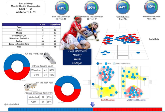
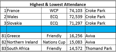
By John Considine Earlier this week, as I was grading summer examination papers, Seamus Coffey sent me the following statistical output on the Cork - Waterford, Munster Senior Hurling Championship game. The output was produced by Ray Boyne (here). It is an example of what inter-county teams use to examine their performance (Ray was involved with the Dublin senior footballers for a number of years). Of course, the statistical and video analysis that is conducted by teams goes much deeper than what is presented below. Last January, I attended a presentation organised by Avenir Sports on the type of work they do with inter-county teams. In the presentation, Sean O'Donnell outlined the extensive work done analysing the playing and training performances of the Cork senior hurling team. I was left pondering the gap between the statistical analysis on academic performance and those of sporting performance. While academic assessment practices are improving, they could benefit from a look at the sporting world. At a minimum GAA teams would have the above type of material to them before their next training session (usually two days later). Timely and detailed feedback is followed by planned performance improvement. A pretty good system. Unfortunately, a portion of academic assessment falls short of timely and detailed feedback. Sometime this is a function of student numbers and the lack of technological supports. However, there are some technological developments helping to facilitate academic performance improvement. For example, in economics there are systems like MyEconLab and Aplia. The latter was developed by Paul Romer. Romer's thinking about the crossover between performance assessment in sport, and that in the study of economics, is discussed by David Warsh in his book Knowledge and The Wealth of Nations. Romer believes that students need a coach, and that as a coach what he "needed was the equivalent of a stopwatch, or a heart-rate monitor - some way of gauging their performance and discovering which areas needed work". As a result, Romer developed an online assessment system for students of economics that allows them to assess their knowledge and receive immediate feedback. Aplia is limited in its application and is far from providing a silver bullet for students of economics (see an evaluation of its potential here is a piece by Brendan Kennelly, Darragh Flannery and myself). However, Aplia and MyEconLab do provide another support mechanism in evaluating student performance and providing timely feedback.  The above sporting statistics and assessment systems are only scratching the surface when compared to the way such data is used in other settings. An example of how F1 use an almost unimaginable amount of performances statistics is explained in a TED talk by Peter van Manen (here). The skills involved have been put to good use outside of F1. Van Manen explains how they used their expertise in data analysis to help monitor the health of babies in life and death situations. As time passes, we can expect the the use of sporting statistics to increase. However, they are unlikely to prove a short-cut to success on the field. They can be a useful supplement to hard work rather than a substitute for it. In my experience, individuals who seek out new methods as a means of reducing their effort come unstuck. It is those that use new method to improve their performance that accumulate the benefits. I hope that not too much time will pass before we can see further improvements in the assessment systems in academia. By Paul O'Sullivan A recent report on Sky Sports News (see here) outlined a UEFA proposal that if a player must leave the pitch to receive treatment for injury as a result of foul play, then the player that committed the foul may also be required to leave the pitch until the injured player is fit to return. The rationale behind the proposal is well-intentioned. At present, if an injured player must leave the pitch, their team is temporarily at a numerical disadvantage. Hence, there may be an incentive to committing a foul that requires an opposing player to receive off-field attention. Any policy that eliminates this incentive is to be welcomed. 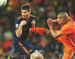 As ever, though, it is not sufficient to introduce a new policy to offset ‘market failure’ without taking into account how those subject to the new policy may react to it. As always, the biggest fear is that the new law will be taken advantage of in a manner that does not reflect the spirit of that new law. The main problem is that a player may ‘dive’ and/or feign injury, especially if fouled by one of the opposition’s better players. By requiring off-field treatment for an injury that does not exist, and ensuring that he opponent’s team is also down a player, the ‘fouled’ player’s team may be better off. Similarly, the ‘injured’ player may not have an incentive to get back to the pitch as soon as possible in order to keep the opponent off the pitch (in the case of genuine injuries, this would be welcome as the need to get back on the pitch to help the team is reduced). Where games are particularly close or important, especially near the end, this incentive outlined above may be greater. As with any form of ‘gamesmanship’ or cynical play, facilities like retrospective action, video evidence, independent medical assessment and severe punishments can be utilised to prevent such behaviour. By Robbie Butler The Irish Times carried a very interesting piece by Emmet Malone yesterday which examined recent attendances at Republic of Ireland home internationals. The game against Turkey last Sunday had an official attendance of 25,191 however, it has been suggested a figure of 15,000 is closer to the truth, given that roughly 3,000 people left after the earlier FAI Junior Cup final. Malone takes us down memory lane as he reminisces about Lansdowne Road and writes: "Before the redevelopment of Lansdowne Road just about every game attracted close to a full house and almost everyone paid for their tickets because there was a genuine fear that if you let your block booking go for the Malta game to someone else then when Germany, France or Italy came to town you might genuinely struggle to get in”. The economic crisis, increased stadium capacity and poor management of the FAI’s Vantage Club scheme are all mentioned as possible reasons for the decline in international attendances. The quality of the national team is surely another factor, with the side languishing in 66th place in the world rankings, two places above our lowest position ever, achieved in March of this year. So how accurate is this assessment? Well, it's fairly spot on. I’ve gathered attendance data on Irish internationals played in Ireland (we ignore trips to London and the USA) since the turn of the millennium and consider five venues ; Lansdowne Road (41), Croke Park (13), Thomand Park (2), the RDS (2) and the Aviva Stadium (25). There are various ways to present data like this (I can make available upon request) for the 83 ‘home’ games Ireland have played since meeting the Czech Republic on 23rd of February 2000. The analysis covers 35 qualifiers for both the World Cup and European Championships, two World Cup playoffs (Iran & France), one European Championship playoff (Estonia), 3 Nations Cup matches and 42 friendlies. The tables below present a subsection of data from 2000-2014. These figures don't make for great reading for the Aviva. As expected (first table above) Croke Park has the top three attendance stats, mind you the French game (#1) was played in November 2009 and begs the question does/did the economic downturn matter that much? Wales and Slovakia were (association) football games 1 and 2 at the historic GAA venue. While the lowest attendance was posted against South Africa in Limerick in September 2009 (amazingly just two months before the French record attendance) the venue had a capacity of just 25,800. Neither Greece nor Northern Ireland appear much of an attraction. The former (Greece) can certainly point to the economic crisis as a reason for not being able to travel to support their team, could distance have been a factor for the latter!? The second table above presents data on the average attendance across all five stadiums since 2000. In many ways we can ignore the smaller venues (RDS and Thomand Park) where only two games were stages at each. Lansdowne Road continues to outperform the Aviva (and Croke Park) by quiet a considerable amount. Over the past fourteen years, on only six occasions has the official attendance fallen below 40% of stadium capacity (third table below). The Aviva was the venue for all six of these matches. However, the Aviva (and Croke Park) find some redemption in the fact that the two highest friendly match attendances since the millennium have been at each stadium (fourth table below). A word of caution, neither ever sold out for a friendly. Between 2000 and 2009 Lansdowne Road sold out fourteen times, four of which were friendly against Portugal, Russia, Brazil and Italy. A further seven friendly had 92% to 97% of seats sold. Finally, to Fortress Lansdowne Road. Paul Malone claims that "Before the redevelopment of Lansdowne Road just about every game attracted close to a full house". This is a bit like saying the sun was always shining during summer holidays when I was a child. It's what we like to remember. While Lansdowne consistently outperformed the Aviva, it wasn’t always full. Between 2000 and 2009 attendance at the venue dropped below 70% of capacity on six occasions. A friendly against Finland on the 15th of November 2000 saw the stadium just half full! *Thanks go to fellow contributor David Butler who provided data on games held in the Aviva since 2010.
By Ed Valentine A recent piece in the New Scientist (here) claimed that the Chelsea team of 2005-6 were the best team ever (at least since 1888). The New Scientist piece is based on an article in the Journal of the Royal Statistical Society by Rose Baker and Ian McHale (here). Arsenal fans will point out that a team that goes undefeated for a league season surely deserves to be classified as the best team ever. Manchester United fans will claim that a great team is successful in both England and Europe. Opta provided the data.
By John Considine  There is a superb article by Philip Connolly in the recent edition of The Sunday Business Post titled 'By Jorge! Ronaldo's Agent and his Dublin connection'. Connolly explains that the attraction of Dublin for Jorge Mendes is "the same for many other body corporates - tax". I particularly like the sentences "At the head of a vast multimillion-euro business, the Portuguese agent sits atop an organisation that spans from Porto to the tax haven of the British Virgin Islands. In the middle is Ulysses House, a nondescript office block just north of Dublin's River Liffey. It is here that a subsidary of Gestifute, Mendes's agency, shares a registered office with more than 150 other companies." Connolly describes the British Virgin Islands as a tax haven and in the following sentences he discusses the 150 registered offices in Ulysses House. Imagine all the economic activity that takes place in Ulysses House! The article is not just about taxation. Connolly also discusses 'economic rights participation agreements' and the role of an entity called Quality Football. Most of us might associate Carlos Tevez with third-party ownership of a player's sporting rights. Connolly says explains how Norwich's Ricky van Wolfswinkle is another player with a connection to such agreements. Tevez kept West Ham in the Premier League while embroiled in controversy over his arrangements. Van Wolfswinkle was relegated with Norwich after a season where he contributed almost nothing on the scoreboard. By David Butler
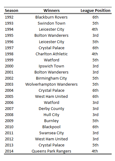
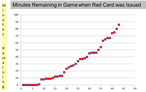
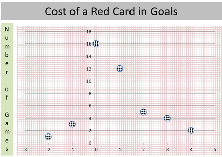
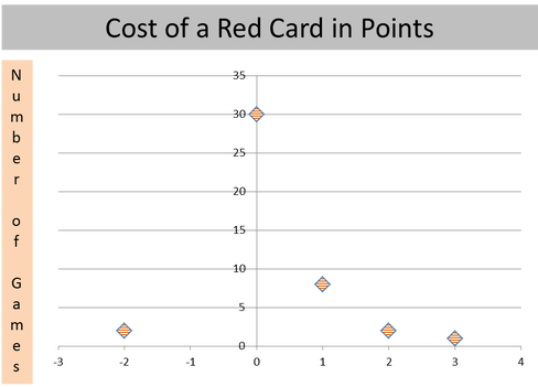
During the Winter Olympics I recalled a classic paper that explored how counterfactual thoughts impacted emotions (some days later the paper was discussed by Cass Sunstein on his blog here, again in light of Sochi). Simply put the theory is that, in terms of happiness, finishing 3rd and receiving a bronze was a better outcome than finishing 2nd. An interesting twist on this is often suggested this time of year during the football league play-offs when I here fans argue that teams are better off finishing 6th in a league and narrowly reaching the play-offs, rather than finishing 3rd and achieving the same feat. The folk psychology goes that those finishing 3rd are disappointed for not getting promoted automatically (upward comparison), while those finishing 6th view entry to the play-offs as a lucky bonus to potentially play in the ‘most expensive game’ in football. The team that are 3rd have the added pressure of being play-off favourites while the 6th team don’t face the same expectancy levels or psychological angst of a near miss. I didn’t have time to collect all the data yet but from looking at the Championship/old First Division play-offs from 1992 (since it began in its current format) approximately 35% of the winners (the most) were 3rd in the league. Only 13% of the play-off winners finished 4th in the League and were the fewest. I need to collect more data for other leagues but the story of ‘being better off finishing 6th’ at the moment, looks like one for the myth list! More to follow. By Ed Valentine Yachts bobbing gently in the harbour; girls in impossibly expensive swimsuits and thousands of horsepower galloping around the narrow streets of the world’s most glamorous street circuit. The Monaco Grand Prix is the blue ribbon event in the Formula 1 calendar. It attracts the glamour of the world’s intelligentsia as a thousand of F1’s new best friends descend on the principality, but from a purists point of view the tight and twisty streets provide little room for wheel to wheel racing. From the economist’s angle it serves as the best example of the season in how strategy unravels and demonstrates that the event may not be won by the fastest driver. Strategy is key but there are certain factors to dial into the calculator before the teams go racing. The chance of a safety car at Monaco, with its tight street circuit layout and zero run off area, is 80% - the highest of the year. This season the cars have less down force in the corners and slide about on corner exit much more than in the last 15 years so this is a factor to consider as any type collision with the barrier, no matter how minimal, will almost certainly bring the safety car into play. Best opportunity forgone: what is the game theoretically optimum strategy for the 78 lap Monaco GP?  Pirelli will bring the super soft and soft tyre to the event. The super soft is faster but less durable. The soft tyre is more durable but is slower. Both sets have to be used by all drivers for at least 1 lap during Sunday’s race unless it rains. The super soft tyre would be the best tyre to run for the entire race in dry conditions but rules do not permit this. Therefore plans have to be made in order to determine the most time efficient strategy taking into account tyre wear. If there is an 80% chance of a safety car period during the race a uniform distribution would tell us that there will be a 40% chance in the first half of the race (laps 1-39) and a 40% chance in the second (laps 40 – 78). 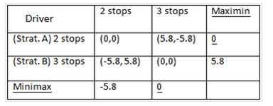 Comparative versus absolute advantage. Comparative versus absolute advantage. Zero sum game: Time gained for one driver, time gained for other driver). The optimal strategy would therefore be to run Strategy A, and hope the opponent runs Strategy B. But what about safety cars? Based on the tyre time differential the optimum time to stop for a one stop strategy is between laps 27 and 30. The road has been resurfaced around the Monaco harbour and so it is unlikely that a one stop race will be on the cards. Since the appearance of the safety car would neutralise the race it essentially allows for a “free” pit stop to occur. This“free” pit stop is a unique scenario to Monaco as the track is so short at 3.34 km; the pit lane can be reached from the farthest point quicker than the safety car can gather the field allowing the leader to maintain track position provided the track is not blocked. 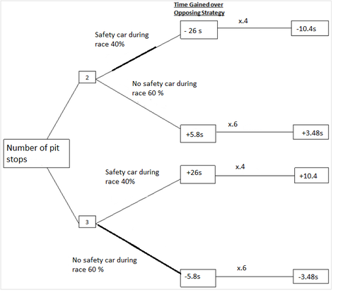 This would favour a driver who is opting for one pit stop. One pit stop will be unlikely so it would therefore favour the driver who has a two stop strategy over a three stopper. The time saved would be about 26 seconds. However it will only favour a two stopping driver if the safety car occurs before the second round of stops is made. As can be seen in the game tree a two stop strategy is the best way to go. The race played out as expected. A Mercedes one-two. The strategy of both Lewis Hamilton and Nico Rosberg was key to the race with the former having to apologise after the race for not 'following team orders'. We await the Canadian GP with anticipation especially now that we know the two Mercedes drivers "are not friends". By Ed Valentine and John Considine On Thursday we posted a piece on the cost of red cards. At first glance it seemed the cost of a red card was pretty high. In games with one red card, two-thirds of the teams that received the card lost the game. They also conceded between twice and three times as many goals. These features of the games with red cards probably painted a slightly biased picture because no account was taken of the state of play when the card was issued. In this post we will examine some of these issues. There were 43 games where a single red card was issued. At 90 minutes per game there would have been 3,870 minutes played in these games. However, only 1,305 minutes involved 10 players versus 11 players. The distribution of red cards by the number of minutes left in each game is presented in the chart below. We will keep the analysis relatively simple by examining changes between the time the card was awarded and the final whistle. Imagine a suituation where the score of a game was 1-1 when a red card was issued to the away team. If the final score was 2-1 then we estimate the cost to the team in terms of goals as 1. We focus on the net cost in terms of goals. For example, if the score was 1-1 at the time of the card and it ended up 5-4 then the cost would also be 1. The chart below shows the cost to the team receiving the red card in terms of goals. The negative figure represent situations where the team that received the card scored more goals than their opponents. The -2 in the chart is for the game where Manchester City had their captain sent off against Hull when the score was 0-0. Despite this setback Manchester won the game by two goals. The above chart suggests that a red card will cost a goal every 35 minutes or so. The first chart above shows that more than half of the red cards come with less than 35 minutes. This suggests that the cost of a red card might not be a large as we suggested in our earlier post. What happens when we examine the cost of the red card in terms of points. As in the case of goals, we calculate the cost of the red card by examining the change in scoreline between the time of the card and the final whistle. Where a team was drawing the game 1-1 when the card was issued but lose the game 2-1 then the cost is the 1 point the team would have got from earning a draw. The chart below shows that the 43 red cards cost their teams 11 points in total. It means that a red card costs a team about a quarter of one point. That does not seem a huge amount. Two teams overcame a red card to turn a draw into a win. Eight teams went from drawing a game to losing it (and the point they would have earned). Two teams drew a game they were winning. Only one team (West Ham) lost a game they were winning after receiving a red card. Our post last Thursday showed that teams that are issued red cards do not perform well in those games. This post delved a little deeper and showed that the cost of the red card might not be a big as implied by our first post. It seems that many red cards are issued late in the games and have only a small impact on the result. The average cost in terms of points is 0.25 per game and on average a goal every 35 minutes 10 men are playing against 11. (The data is courtsey of Opta.)
By Paul O'Sullivan  Details of the allocation of TV revenues among Premier League clubs for the 2013-2014 season just finished were released recently (see here and here) and there were some interesting outcomes. Liverpool did top this table. Despite finishing last, Cardiff earned more this season than Man Utd did as champions last year. Of course, comparing 2013-14 to 2012-13 is not keeping ‘all else equal’. The season just finished was the first one under the new Sky-BT domestic TV rights deal which was worth far more than the previous TV deal (£3.02bn as opposed to £1.77bn.). Consequently, the amount of money distributed within a season increased from £0.97bn to £1.56bn. In terms of how the Sky-BT money is distributed, 50% is distributed equally while 25% is allocated depending to both finishing position and the number of appearances in a live game. Overseas TV income is divided equally among the clubs. Liverpool earned almost 60% more than Cardiff. What is interesting about the increased revenue of all clubs is how it may affect the likelihood of the relegated clubs (Cardiff, Fulham and Norwich) being promoted back to the Premier League from next year’s Championship. While 2013’s bottom team QPR (currently awaiting the play-off final for the last promotion place) received £39.7m in TV revenue, Cardiff received a whopping £62.1m, an increase of over 56%. Similarly, Fulham and Norwich received around 58% more than Reading and Wigan did last year. This must surely put the relegated clubs at a huge advantage in terms of competing for promotion.
This increased advantage will be exacerbated by the relegated clubs now receiving much higher ‘parachute’payments of £59m over four years (see here). While Championship clubs receive ‘solidarity’payments from the Premier league, these are dwarfed by the former. The ‘yo-yo’ effect may be about to get stronger. |
Archives
March 2024
About
This website was founded in July 2013. Categories
All
|


 RSS Feed